Pablo Picasso

What’s in a name?

image

Occasionally people ask me about the derivation of the name of this blog. Regrettably, I can’t take credit – it’s the title of a poem by Wallace Stevens. When I first started, I posted a statement on why I chose it:

In his poem ‘Invective Against Swans’, Stevens has a dig at those lovely birds, bringing them down a peg by calling them ‘ganders’ (which are actually male geese), dismissing their ‘bland motions’. I suspect Stevens had no serious gripe against swans; nor do I. They are decorative, they transform a landscape into a painting, they make me hum Tchaikovsky to myself. But stick them into a poem, specifically a contemporary poem, and they become a metaphor for all that is trite and precious. And that’s Stevens’ beef, all those ‘white feathers’ and ‘chilly chariots’. There he was, facing a newish century, a brave new world that had shaken itself out of a war; a new poet trying to find a new way of saying things. He is railing against the grandiose, the clichéd, the humourless. Never one to miss a joke: ‘gander’ is also colloquial in boon dock Florida for ‘a quick glance’, as in ‘get a gander of that’; also colloquial for the village simpleton, as idiotic as a goose. And as we’re talking specifically about a ‘male goose’, could the poet be referring back to himself, possibly to all his fellow bards (how close that is to ‘birds’!) as well?

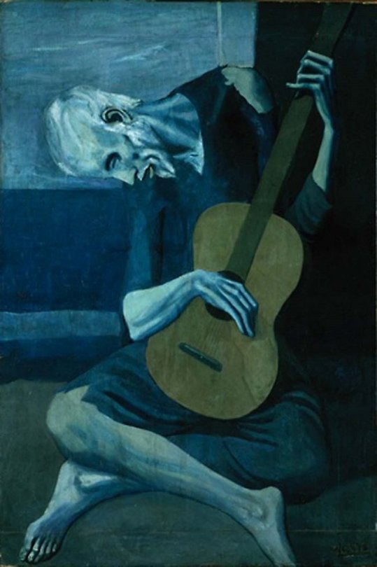
I suppose my aim in this blog has always been to explain my notion of what I find beautiful in the world, which is not always typical (swans being an easy measure of ‘typical beauty’). Stevens has been one of my guides. His work has made me interrogate image and language. When I was thinking what to call this collection of random thoughts, he seemed to provide the right phrase. I am not the only poet to reference Stevens in this way. One of my favourite contemporary presses is Shearsman, its name taken from a line in ‘The Man with the Blue Guitar’: ‘The man bent over his guitar / A shearsman of sorts.’ The musician becoming a maker (a shearsman being a cutter of cloth), as is the painter (Picasso) or the poet (Stevens). The poem is a manifesto for the making of art, and therefore the shearsman is an appropriate symbol for a press that espouses the made poem, an object that sometimes challenges convention, like Stevens, like Picasso. 

image

I have recently discovered that an electronic duo based in Brussels have named themselves after one of my poems. Here is a link to Mannequins on 7th Street:

https://soundcloud.com/mannequinson7thstreet

On their site, they talk about the name as an ambient reference to the general chaos of city life, something they attempt to reflect in their music. Ironically, the poem came not from the place itself, but from a drawing by Anthony Eyton; so like the shearsman of Stevens’ poem, who presides over poet, painter and musician, the title Tony gave his drawing now radiates out over all of us. 

image

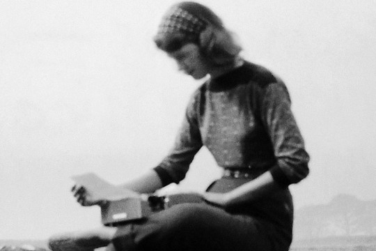
It makes me think too of how some artists have the right name. Sometimes a name even becomes an adjective for an artist’s practice; to say a poem is Plathian is to say its images are dark and strange, its language clipped and sparse. Plath’s name is monosyllabic, it sounds like the noise that a pebble makes hitting the water. She loved the assonance of soft ‘a’s.

I have a name that is invented. The story, although intensely personal to me, is really a common one: my grandparents arrived at the port of Galveston, Texas, with their papers in Cyrillic and not a word of English. The desk clerk asked them to say their name aloud, and he took it down as he heard it. YO-SEL-OFF. As a poet, I value the strange name that no one can spell, that was made up on the spot, that makes me sound rare and exotic, the grandchild of Russian immigrants who went to a new country to make a new life. After all, we are always inventing ourselves, making up names for what we create.
Large bad statue

image

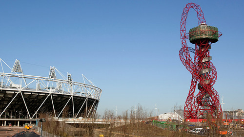
Public art. As a concept, we should embrace it: art for everyone, in an open and democratic space; its purpose to brighten our day, or provoke comment, or simply make us look at our familiar cityscape anew. And there have been many brilliant examples in London. The fourth plinth project in Trafalgar Square (where the giant blue cock, the subject of a previous post, is still crowing); Charles Sargeant Jagger’s Royal Artillery Memorial at Hyde Park Corner; Anish Kapoor’s ArcelorMittal Orbit in the Olympic Park (which was promptly closed as soon as the big event was over; I am looking forward to its reopening); absolutely anything by Moore or Hepworth.

image

So when the powers that be get these things right, they are extraordinary and vital additions to the environment. But when they get them wrong …

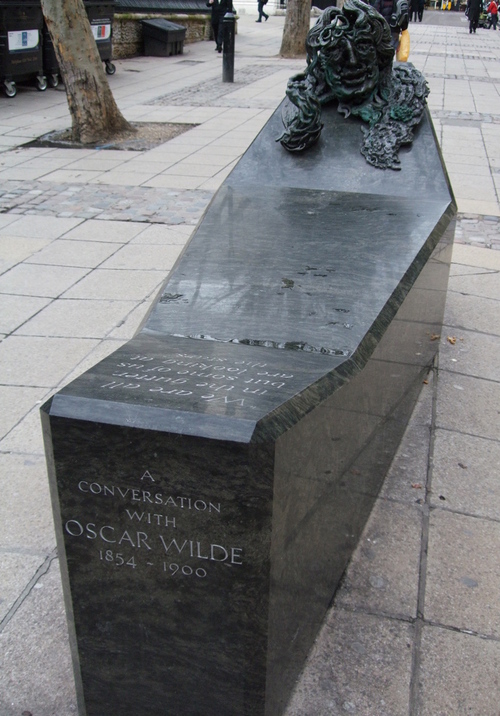
I have always hated Maggie Hambling’s ‘bench’ sculpture, A Conversation with Oscar Wilde. I compare this to Wilde’s grave, designed by the great Jacob Epstein, which must be one of the most beautiful and appropriate memorials ever created – with Epstein’s stylised male angel in flight, his wings like a ocean spreading behind him. To be fair to Hambling, I have mentioned her Scallop in a previous post, a tribute to Benjamin Britten and Aldeburgh and Peter Grimes, a remarkable piece which is for me wholly successful. But there are several things that work against her Wilde. Firstly, the strange composition, with Wilde’s bronze head emerging from a dark granite block that’s more like a grave – its role as a bench is not apparent, nor is the cold hard granite particularly inviting as a seat. The location doesn’t help – in a thoroughfare behind St Martin’s, across from Charing Cross Station; not a place many people think to stop (apart from the winos who congregate around the tube station exit). The head itself resembles a twisted mass of spaghetti or a horror movie zombie. It’s a strange, misguided piece.

image

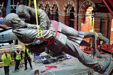
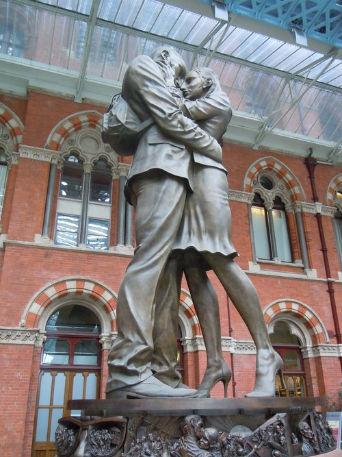
But not as shocking as Meeting Place, the monstrous sculpture of two lovers embracing, like Rodin’s Kiss re-envisioned by Jack Vettriano. It is too huge to ignore, spoiling the beautiful lines of the magnificent St Pancras Station. There was a story that Ruskin used to make a long and indirect detour in his daily walk to avoid having to look at Keble College in Oxford (which offended his architectural sensibilities); no such opportunity for innocent commuters. I was coming off the train, having spent a lovely weekend in Paris, only to encounter the ghastly sight – it’s practically the first thing you see when you arrive in London on Eurostar. Antony Gormley (whose works of public art are always appropriate and resonant – just look at the way people have embraced his Angel of the North or his figures on Crosby Beach) has referred to it as ‘crap’. The sculptor is Paul Day – not exactly a household name – but a quick look on Wikipedia shows that he has other public works on display in London and Brussels. When his monumental piece for St Pancras was unveiled, he came out fighting:

This is not an art work that is going to be selected for the Turner Prize. It isn’t a Damien Hirst sculpture of a pregnant woman stripped down to the constituent parts. It is diametrically opposed to that sort of art. It isn’t about a cynical world view or the artist’s glory.

Some will say it is a chocolate box sculpture. But I don’t want it to be bound by the prevailing view of art. Meeting Place is an appeal to universal values.

image

I don’t see how a sculpture of a pregnant woman, by Damien Hirst or anyone else, represents a ‘cynical world view’. Also, I would be interested to know what the ‘prevailing view of art’ is exactly, at least as far as Day is concerned. He seems to be defending his own work, and at the same time attacking what he considers to be modern, and therefore not appealing ‘to universal values’. It’s like Munnings attacking Picasso (and who is the more famous of the two today?). Day’s attitude infuriates me, even more than his terrible sculpture, the idea that he’s presenting what people want, a radical campaigner in his extraordinary Daily Mail-type conservatism. Talk about ego …

Speaking of which, what government department, what small group of individuals with clearly no taste but plenty of opinions (and a control of the purse strings – Day’s piece cost £1 million), was actually responsible for choosing it?

image

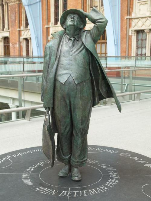
Although I am interested in what is contemporary in art, it doesn’t necessarily mean that I would want Hirst’s pregnant woman encountering me in the train station. It goes without saying that public art should be appropriate to its surroundings. Further along the concourse at St Pancras is a work which is not shouting its value systems at its viewers. It is a conventional, figurative piece of sculpture which is also never going to be up for the Turner, but it is a perfect little celebration of one person – the poet John Betjeman – who, as the laureate of both the Northern suburbs of London and the great Victorian structures of the city, would be delighted to find himself, a compass point, in the middle of the throng, his raincoat catching the breeze like a sail.

Anthony Caro, 1924-2013

It is interesting how reputations are set once an artist dies. Anthony Caro, who died last Wednesday, was described in various obituaries as ‘Britain’s greatest sculptor’ and ‘one of the finest artists of his generation’. Sometimes the loss of a great figure creates hyperbole, but in the case of Caro, it is not too much of an exaggeration to say that he changed the course of sculpture in this country.

From the moment Caro decided not to become an accountant, as his father wanted, and to go to art school, he was single-minded in his pursuit of what came before, as a way of working out what to do next. He learned much from painters, specifically from Picasso and Matisse, who challenged the two-dimensional space of the canvas. It was only after he became an assistance to Henry Moore, perhaps Britain’s greatest sculptor of his day, that he really received the education he desired. Moore threw books at him, showed him classical sculpture, African tribal work, anything that would be useful for the younger artist. But the main thing Moore gave him was the ability to see sculpture removed from the plinth, removed from the gallery altogether. And that’s where Caro took off:

What we wanted to do at that time was to make sculpture work as something in its own right, not as something that depended on its likeness to nature. We wanted to make it more fully abstract, just as music is abstract. But sculpture’s materiality always tries to suck the sculpture back into the world of things. It was for this reason we had to open sculpture up. Our intent was to repudiate the object – and naturally our starting point was painting, Cubism and Matisse. Abstract sculpture began to take charge of the space it occupied, first by standing on the same literal ground as we do, then by bringing the floor itself to bear on the work, and later by taking into its realm table height and the wall.

Caro wasn’t interested in casting. He was interested in taking already-existing materials (as all artists seem to do now) and working them into a particular form. He was interested in colour – his love of Matisse showed him that colour can pitch nature into an entirely new perspective, and there he met abstract expressionism and later pop art head on. He made sculptures that were entirely themselves, which occupied a particular space, and resonated. He was interested in scale, how we measure up to things. He said:

Public sculpture identifies place. It gives the city-dweller a sense of ‘being somewhere’. And so it has to call to its surroundings and to the public. It can – and I believe nowadays it often should - invite participation. How a sculpture is seen by the viewer is always of extreme importance …

I thought of this just a few weeks ago when I was at the Museo Correr, for the Biennale’s Caro retrospective – what was the be his final show. There was a room of early drawings, which I had never seen before, and which gave a sense of the sculpture playing with ideas of weight and depth on paper.

Caro’s work, which was always playing with the new, but with a nod to the old, looked right at home in the hard and shining marble and terrazzo of the Correr. I watched a couple walk around and around one of the larger free-standing pieces that filled an entire gallery, trying to find the welding marks. They finally concluded, as one must, that the sculpture does not come apart, it is not a flat-pack assemblage. And then they turned to the guard and asked how they managed to get it into the building (the Correr’s temporary galleries are on the 4th floor of the palazzo), and the guard pointed to the large double window. And we all had an image of this great flying bird, something fantastic, scaling the heights of the edifice, with all of San Marco watching in amazement. We know the works weigh tons, but they also feel weightless, light, effortless, flowing.

Leaving the Correr and coming into the pristine square of San Marco, I was left with a celebration of form and shape – abstract, yes – but always placing us in the frame somehow, that idea that we should not simply be spectators, but participants. And that is immensely uplifting in an age where so many things are presented to us virtually, on screen. I’ll finish with these words from Caro himself:

All the artists I believe in are some sort of optimist. Optimism of this sort, like serenity, is hard won. Art is a religious activity – it’s about living. Decay and dying are something else. I can’t allow myself self-pity or a morbid attitude. There’s too much left to do in the studio. That’s the source as well as the place for my optimism.

Why I am not a painter . . .

although I have always wished I could be. In a place like Antibes you can’t help but notice the clarity of the light, the jewel-bright hues (not like the washed drab of London). You want to grab a brush rather than a pen; there are not enough words for ‘blue’ in the English language to do justice to sea and sky, it is so easy to drift into cliché. This is a landscape for painters, remade by Matisse and Miró and, of course, Picasso.

Perhaps painters don’t see the difference between brush and pen in the same way? Picasso was interested in the representation of things: ‘I want to SAY nude. I don’t want to do a nude like a nude. I just want to SAY breast, SAY foot, SAY hand and belly.’ His nudes are about the complexities of women as well as their appearance, his intellectual and emotional relationships with women.

‘Painting is just another way of keeping a diary,’ Picasso said. He came to Antibes in the summer of 1946 with Françoise Gilot and their young son, Claude, and was offered a studio in the Château Grimaldi (now the Musée Picasso). He immediately immersed himself in his work. Gilot recalled that he ‘spoke especially of the white light which brings out shapes rather than colours.’ But the colours are striking — as if the artist has emerged from darkness (the darkness of the war) giddy with the richness of everything around him. Even in still life (much more dramatic in French, nature morte; the emphasis on ‘death’ rather than ‘life’) his fish and flowers are buzzing with energy; the vivid spikes of les oursins. When asked what attracted him about sea urchins (which are everywhere still, on market stalls, outside restaurants) he replied ‘the eyes like being surprised.’

Perhaps it’s easier to capture happiness in paint than in print? Our host, Lynne Rees (aka ‘The Hungry Writer’) takes us to her favourite picture in the museum, Joie De Vivre, and poses that very question. And the painting is joyous, a celebration by the seaside. We know Picasso was happy in the months he lived in Antibes: the war was over, he was in love with Françoise and his little son, he was productive, he had a studio in a castle overlooking the sea.

Sometimes words aren’t enough for all that. And if we are unable to paint it, then perhaps it’s enough just to live it (and allow the eyes to be surprised) and store it in our memory for later …


http://www.antibes-juanlespins.com/eng/culture/musees/picasso/actualite/index.html

http://www.lynnerees.com/