The New York Times

Taking stock

image

On another art crawl around London with Paul Carey Kent. Paul’s walks are now so popular that sometimes twenty or more people are trailing after him (he walks fast) from one gallery to another (and in all, he is known and greeted warmly). These walks are not just a way to see what’s on in London, but also a way for artists and writers to meet and compare notes, look at things together and sometimes have a good old fashioned argument about what works and what doesn’t. Paul always plans the itinerary in advance, and today, we are covering Kings Cross, Old Street and Bloomsbury.

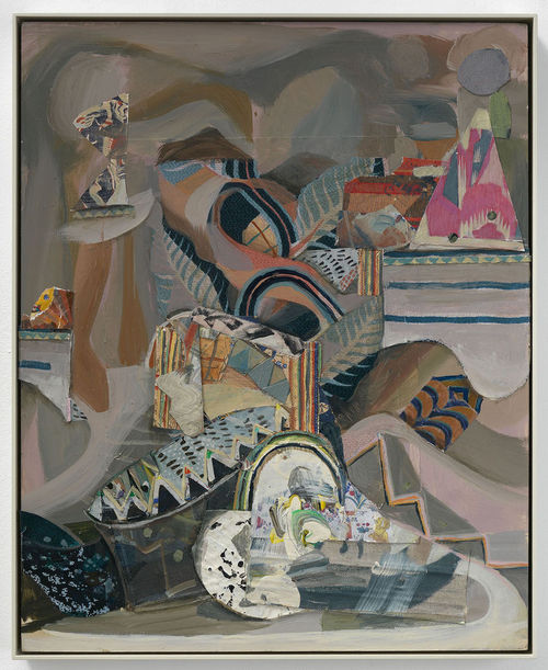
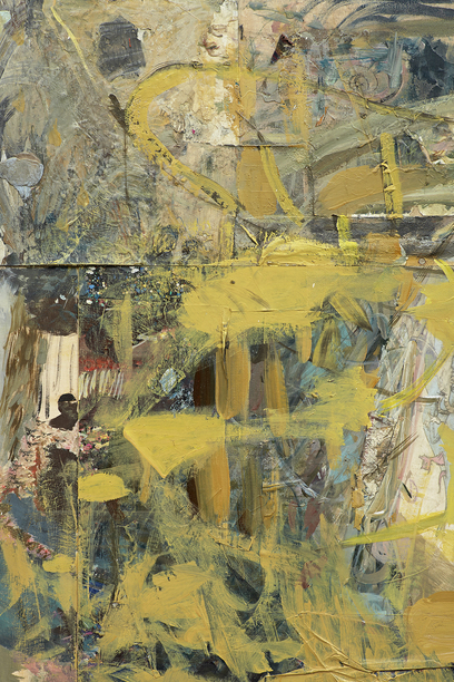
Next door to each other, in Victoria Miro and Parasol Unit respectively, are new shows from Sarah Sze and Katy Moran. A dialogue emerges between the two artists (women of roughly the same generation) centered around collecting and assembling. Although Moran’s work is on the surface more traditional, focused on painting, it’s what she crams into her small-scale canvases that is surprising. Her titles suggest the bright and kooky world of cartoons, circus, the world in all its variety, and they give a hint that the paintings are more than they appear. From a distance, they are densely patterned, energetic abstract swirls, but only when you get up close do you realize that they contain multilayered collaged bits from books and magazines, often masked or veiled by Moran’s brush. Figures emerge from the chaos of paint. Moran turns the canvas around while she’s working, so everything’s turned on its head, and there’s often no clear way in, we just need to follow her down the particular maze she leading us through. 

image


I saw her work first at Tate St Ives some years ago, and while I liked it then, the new paintings seem to be richer, more worked, more complex – the difference between early Pound and the Cantos. Like opening an attic door and peering into the darkness and clutter, knowing you will find treasure.

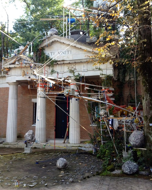
Although there are silkscreen prints in Sarah Sze’s show (not so successful for me), she is primarily a sculptor, or more accurately, a compiler of installations. I was impressed with her Venice Biennale show in 2013, when she turned the United States Pavilion into the lab of a mad scientist, the strange assemblage actually snaking its way out of the building.

image


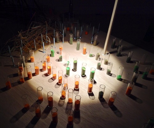
I loved the chaos and bustle, but also felt there was too much (and my photos capture certain individual elements I loved rather than trying to encompass the entire installation). 

image
image


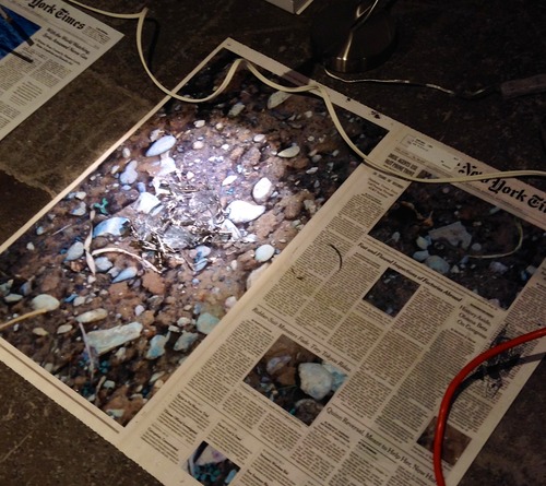
Here at Victoria Miro, not everything works. The installation on the lower level seems without focus. The piece is called Still Life with Desk, and the individual elements don’t seem to add up to much, apart from maybe trying to get at what’s in the head of the artist or writer at the moment of creation. It’s the piece upstairs, Calendar Series, that impressed me and reminded me of the best moments of her Venice show.

image


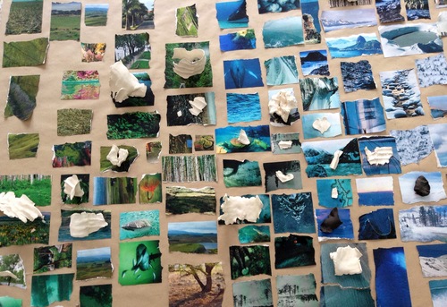
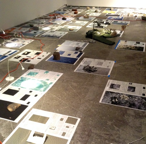
The floor is covered in front pages from The New York Times, spanning a period of months from July to October 2013. Sze has doctored the cover photographs, replaced them with images that appear to be from the natural and celestial worlds, created an assemblage of three-dimensional objects to match the photos. The pages is lit with a series of desk lamps, each casting a small pool of light over its chosen page in the darkened space. I think of labs, libraries, archives, places of study or research, the object of the research perhaps newsworthy, but odd in its isolation, its difficulty to categorise in any satisfactory manner.

image


I’ve focused on those two exhibitions in detail, but we also covered the extraordinary Richard Serra show at Gagosian http://www.gagosian.com/exhibitions/richard-serra–october-11-2014 the disturbingly beautiful sculptures of David Altmejd at Modern Art http://www.modernart.net/view.html?id=1,4,1260,1261 and the gorgeous ‘tapestries’ made from old bottle caps and bits of metal by El Anatsui at the October Gallery http://www.octobergallery.co.uk/exhibitions/2015els/index.shtml . All worth catching.
High Line highlights

A sunny day in New York last week, exploring the Chelsea galleries. I have a folk memory of Chelsea (from my undergraduate excursions to far-flung diners and cavernous night clubs) as the unchartered periphery of the city, rubbing up against the Hudson River, a hinterland of piers and warehouses. It still has that rough and seedy feel (despite the incursions of high end designers like Comme des Garçons and Balenciaga); the galleries mixing with garages and light manufacturing units, happily ignoring the other in the jostle, but still borrowing from their industrial neighbours a certain aesthetic: all concrete and brick, unadorned, no-nonsense.

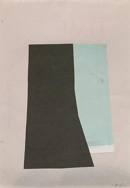
So once inside the vast empty space of Ameringer McEnery Yohe, Suzanne Caporael’s small and delicate collages might have been lost. But they had a powerful cumulative effect. As I approach, I realise there is something familiar about the paper they are on, until I’m even closer and realise from the reassuring greyish white that they are pages from The New York Times, identifiable, as some still contain snippets of text or the date. The title of each piece is taken from the particular location in small-town America where it was created, where the out-of-town artist took solace in finding the familiar paper, a daily ritual. The collages are all about ritual, tracking time (there even in the paper’s name, not just ‘time’ but the ‘times’ in which we live) recording place, each the same size. I like the suggestion of important news about to be imparted, instead replaced (or obscured) by these Matisse-like blocks of colour. The New York Times has a particular madeleine-like resonance for me as my parents’ paper of choice, the symbol of accurate information and correct politics to me as a child (my mother, although four years in London, still reads it every morning online). So I understand Caporael’s use of the paper as a base for her collages: newspapers mark not only ritual, but the beginning of the day, waking to what is happening in the world over orange juice and coffee. As a displaced east coast American, I can understand what it is like to find the Times, like an old friend, somewhere far from home (I have the same feeling now when I seek out the Guardian on foreign newsstands).

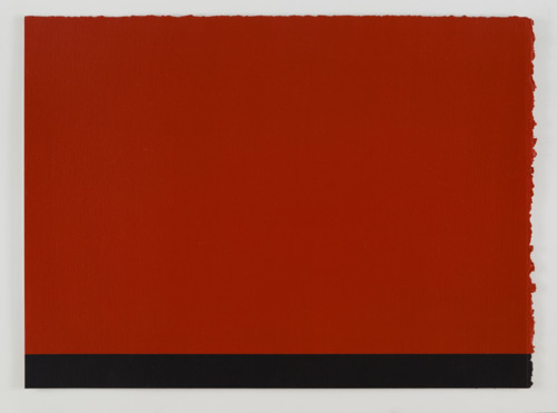
Her work chimes for me with the drawings of Anne Truitt, on show at Matthew Marks. Truitt was a sculptor, who’s experience as a nurse’s aide in the 1940s made her acutely aware of the human body (she made her first-year art students draw a skeleton and read Vesalius). She said ‘the true space you are living in is inside yourself, not on the outside .’ Interesting, then, that her drawings seem to be about architecture – geometrical constructions that explore three dimensions in two, unlike the flat planes in Caporael’s collages. However, what Truitt and Caporael have in common is in their attempt to understand special relationships through colour. After discovering the paintings of Barnett Newman, Truitt felt that ‘color rose up and towered over me and advanced towards me.’ Truitt talks about ‘metaphorical color’ the sense of ‘color having meaning’, and I know what she’s on about. If you put blue on the page, you are stating all the associations of blue – with melancholy or sadness, or truth or fidelity. So the drawings are about spaces, not actual physical spaces, more like mental states, planes of discovery, moments where things become lucid, make sense through seeing (and seeing brings awareness).

Here is Truitt, writing in 1950, about the experience of driving 270 miles through the night on a Texas road from San Antonio to Midland:

The road was absolutely straight in front of me, and had broken lines, or yellow lines, which helped. There was a big space on either side of the road, which was a Macadam road, and then space on either side, and beyond the space there were fences and behind the fences there was tumbleweed. It was very beautiful really. And every now and then I’d see those little eyes, these little eyes of rabbits in the headlights. And I’d just drive. Sometimes I’d drive for five, ten, fifteen minutes without seeing a living thing, or even any lights. And then I would see way off in the distance, I’d see one light. Which meant somebody was alive out there. The rest was completely flat, like being a pea on a skating rink. Above me was this huge arch of sky. My whole concept of space changed during those hours. Luckily I was alone. There was no radio. I wouldn’t have played it if there was one. Complete silence, and the wind, and this wonderful space. One of the happiest memories I have. Hard to get enough space in life. So that changed my life.

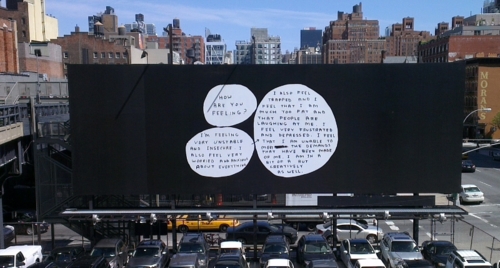
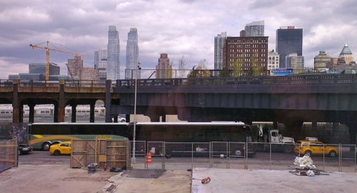
I think of the lines and planes of roads as I come away from those drawings, back into the street, and then up, on to the High Line; a place that didn’t exist (well, at least not in its current form) the last time I was in the city. The High Line was built in the 30s as an elevated track to move freight trains. Joel Sternfeld took beautiful photos of the derelict line in the 80s, an eerie, abandoned place, already a park of sorts, but not an official one. Now it is beautiful again, in a different way, with ornamental grasses and flowers growing in between the tracks. Rus in urbe. From here, you see the city differently than from street level; not so high you can’t see pedestrians below, but high enough to give perspective. A whole block is laid out before you, the city’s grid exposed along four corners. At one point suspended over the road you can sit on a bench and watch the traffic on Tenth Street passing beneath. True, it is calmer than street level, but the city rumbles on, as ever, on below.