Berlin

The invisible ruin

One of my favourite books, In Ruins, considers our perpetual fascination and joy at the sight of a crumbled wall or toppled tower. Its author, the art historian Christopher Woodward, writes:

When we contemplate ruins, we contemplate our own future. To statesmen, ruins predict the fall of Empires, and to philosophers the futility of mortal man’s aspirations. To a poet, the decay of a monument represents the dissolution of the individual ego in the flow of Time; to a painter or architect, the fragments of a stupendous antiquity call into question the purpose of their art. Why struggle with a brush or chisel to create the beauty of wholeness when far greater works have been destroyed by Time?

Yet in the last hundred years, perhaps since the notion of Total War was born, we are far more likely to rip it up and start again. It was certainly necessary to rebuild from scratch in the wake of bombs that destroyed entire cities (as evidenced in my recent trip to Kassel). Those parts of London which were particularly targeted are conspicuous in their uniform 60s architecture – the Elephant and Castle immediately springs to mind. But the recent (and completely brilliant) BBC documentary The History of Our Streets also told of a desire on the part of local councils to sweep away the old and replace it with the new (sort of like Mussolini’s plans for Rome). Blocks and blocks of perfectly sturdy Victorian terraces were demolished to make way for modern tower blocks (a number of which have already been condemned and torn down, while Victorian housing steadfastly remains standing). It was the Poet Laureate of the day, Sir John Betjeman, who spearheaded the twentieth-century campaign to save older buildings of architectural merit from the wrecking ball. The organisation that he started, SPAB (the Society for the Preservation of Ancient Buildings) continues his work to this day by assigning listed status to buildings in an effort to protect them for the future.

I’m not saying that old is always necessarily better, but more that sometimes it is valuable to remember what came before. The character of London, that mix of ancient and modern, was to a large degree, determined by where the bombs fell, but it usefully shows us who were are and who we were at the same time.

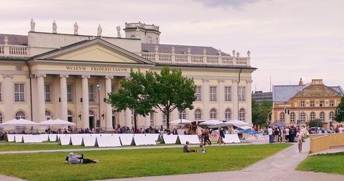
Back to Kassel, where that character is harder to determine. As I mentioned in my last post, 90% of the city centre was annihilated, and so there was little left standing to preserve. Although the Fridericianum was completely rebuilt in 18th century-style, the impulse was to start from scratch, and so most of the centre is permanently locked in the 60s and 70s.

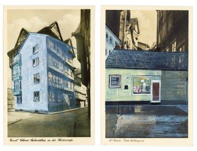
Which is why Tacita Dean’s piece for Documenta 13 is so fascinating. As a long-standing resident of Berlin, Dean understands the impulse to start again (although Berlin, as I’ve said before, is a great city for the recycling of buildings, and you can find traces of the Wall marked in a discreet pathway beneath your feet). She has collected a number of pre-war postcards of Kassel, showing views of the old city centre, and has painted over them to show what stands there now. In my previous post, I talked about my friend Siriol Troup and how she likes to go round Kassel with a guidebook from 1901; Dean’s piece stems from a similar desire – to understand what came before, what it was like before your time.

To understand what it was like before your time is the second dimension to the piece. Dean then sent the cards by post to Kabul c/o Jolyon Leslie, the former CEO of the Aga Khan Trust for Culture. But the project is dedicated to another Jolyon, her late father. So she sent postcards of a place which no longer exists because of war destruction to a place which is currently going through what Kassel went through nearly seventy years ago; and addressed them to a man who shares a name with the father of the artist, who is no longer alive to receive them. The piece seems then to be about inheritance, noting things that have disappeared so that future generations do not forget to record what they have before it is gone.

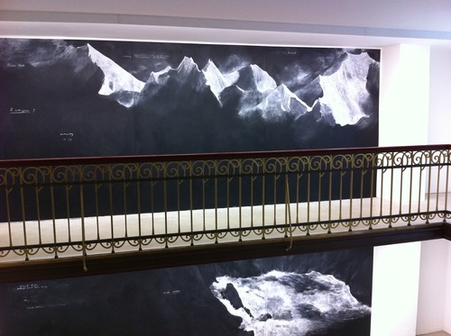
A related installation is about bringing Kabul to Kassel, having already sent Kassel to Kabul. In the staircase of an ex-finance office (an older building, possibly from the twenties, which survived the bombs) Dean has installed a large panorama of the rivers and mountains of Afghanistan. These are drawn on chalk on large blackboards, so that the viewer could be a child in a classroom learning of this distant place which is being obliterated from the map (I remember a similar experience when I was growing up, learning about Viet Nam while the country in which I lived was destroying it). The chalkboards could also represent the fleeting nature of the landscape (which, like chalk, can be wiped away), although there is something more permanent about a mountain or a river than about man’s built environment, which can be toppled with one smart bomb.

Dean’s double work for Documenta is one of the most moving and beautiful I have seen recently which represents both our time and the past, and the desire to preserve and record, even those things which have already left us.


More images of Dean’s piece here: http://www.contemporaryartdaily.com/2012/06/documenta-13-tacita-dean/

Photos by Amy Stein and Andrew Lindesay
It's raining poems

There have been many accounts on Facebook and on various blogs (including this lovely account from Katy Evans-Bush: http://baroqueinhackney.com/2012/06/27/the-reign-of-poems/) of the Rain of Poems that showered down on London on Tuesday night, making a welcome change from the month of the ordinary wet kind of rain that’s drowned out summer. It was, as many commentators have already said, a joyous and exuberant occasion that brought poets from all over the world together with the citizens of London. At twilight, a helicopter appeared in the skies above Jubilee Gardens, and dropped little packages containing hundreds of poems which fluttered down into the hands of waiting spectators. It was a grey evening (as most evenings have been recently), and so the poems were caught in a floodlight that caused the white paper they were printed on to glow ghostly silver (more like snow than rain). In all, 100,000 poems were released over a half-hour period. Because of the light winds, poems were scattered onto the surrounding bridges, the roofs of flats, as far as Fleet Street and the Strand across the river.

The creators of this project are Casagrande http://www.loscasagrande.org/, a Chilean art collective, whose practice is publishing-based and whose aim is to distribute poetry through a series of interventions and ‘art actions’ (as they say on their website) to the public. All their poetic actions and other activities are free to the audience receiving them; their slogan is ‘can’t be sold, can’t be bought’ (no se vende ni se compra). The Rain of Poems over London is part of a larger project of releasing poems over cities that have been bombed during military action. Their first ‘cargo of poems’ was dropped over Santiago in 2001, and since then they have performed the ‘Bombing of Poems’ over Berlin, Warsaw, Guernica and Dubrovnik. They have applied to re-enact the project over Dresden.

The poems that are dropped are by poets from the host nations, and they are printed in both English and Spanish. Because the London event also marks the beginning of Poetry Parnassus, the mammoth Olympic gathering of 200 poets (one from each nation participating in the 2012 London Games), they have also been represented. In the fight (yes, fight – it may be the only time in my life when I see people jostling and jumping to catch poems) to grab one of the falling bits of paper, I managed to scoop up four poems – from Andrés Anwandter of Chile, Oxmo Puccino of Mali, Tom Warner of the UK, and Katerina Iliopoulou of Greece. A completely random and accidental meeting of poets brought to me by chance and changing wind velocity.

Casagrande says that this performance ‘creates an alternative image of the past and is a gesture of remembrance as well as being a metaphor for the survival of cities and people.’ What I like about their project is the democracy of it. On one level, it is about remembrance and resilience, as they say, but on a more basic level, it is about the circulation of poetry to as wide an audience as possible, who simply have to be present (and possibly good at catching) to receive work which is distributed to them for free. It is a political statement in the stand against war, but also in its mode of publishing: I think of the broadsheets of the 17th century, which were used to circulate ideas. We have lost that culture of radical publishing (although bloggers and tweeters are bringing it back) in the spool of twenty-four-hour television news. This is the poem as art action, as object (the poems are beautifully designed and printed, on recycled paper and using biodegradable inks), as statement, as an emotional and spiritual connection of people. The performance is a beautiful and moving gesture, but also a spectacle. Shouldn’t all art and poetry bring together those elements?

Do you read me?!

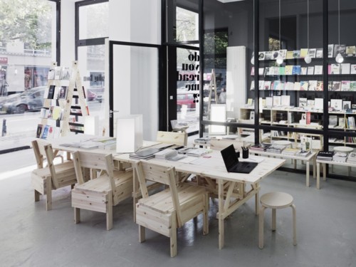
We stumbled onto the Reading Room at do you read me?! by accident, the way you do when you are wandering around an unfamiliar city without any real destination or goal. I discovered later that their Potsdamer Strasse branch (or, as it says on their website, a place for lectures, exhibitions, debates and all the still slumbering ideas and projects) is a sister location to their ‘bespoke’ magazine shop (which will compile a personal assortment based on your interests) and lecture space in Mitte. It is an indication that the area around Potsdamer Strasse is going to be Berlin’s next big art destination, as there are already lots of galleries opening in the area.

Berlin is not short of galleries, nor of bookshops, and so it seems logical that the two should come together in some way. It is therefore also logical that you can ‘curate’ a bookshop, in the same way you might ‘curate’ an exhibition (Berlin is a place where even the trees are curated: see below). Thus the simple but brilliant idea of asking inspiring personalities in art, culture and design to select their current favourite books. It’s not a new idea: literary pages of magazines and broadsheets have been asking authors and cultural figures to chose their books of the year or to name their bedside reading for some time, and here in England, Waterstones, one of the most enlightened of the large chains, has always had a policy of asking their booksellers for personal picks (indeed, most bookshops seem to do that these days).

But what is new (and exciting) here is the presentation. Long thin sheets entitled what do you read?! hang from the walls on pegs (for browsers to take away). One side lists the inspiring personalities who have been asked for their picks, and on the reverse, is an individual selection. For example, the artist Jonathan Monk has been reading The Complete Writings of Donald Judd, American English by Richard Prince, The Jeff Koons Handbook, and lots of magazines, including i-D, Wallpaper, and Hello (yes, Hello). Each title has a short personal description by the selector. So Monk says that Judd’s Complete Writings are ‘A comprehensive guide to very little’ and that Wallpaper magazine is ‘To be read on the toilet. ‘ The inspiring personalities’ comments are generally humorous and meaningful, and give us equal insight into books and readers. A list of what someone is reading is a window into his / her mind and soul.

Each of the inspiring personalities’ books are available for sale, with bright pink cards tucked inside their pages (like library cards) saying which personality has chosen the book and why, so that the selections are cross-referenced.

There are chairs to sit in while perusing. There is coffee.

In another room are general selections of books: art, architecture, design, fashion, typography, cultural essays. Again, baggage restrictions prevented me from going completely crazy, but I came away with a few selections:

I like your work: art and etiquette is Paper Monuments answer to Miss Manners meets Andy Warhol. Various artists were interviewed for their opinions on courtesy in the art world. Jessica Slaven is asked ‘What is the role of etiquette in the art world?’ to which she replies, ‘ The art world should have a separate code of behaviour from civilized society to indicate its self-impressed and savage nature.’ Roger White, in a section entitled ‘How artists must dress’ states that ‘The relationship between an artist’s work and attire should not take the form of a direct visual analogy. A stripe painter may not wear stripes.’ And Wendy Olsoff, when asked ‘When does breach of etiquette play a role in embarrassing or awkward encounters?’ simply answers ‘One kiss, two kisses, or three? One is never sure.’

http://www.papermonument.com/i-like-your-work/

I also bought when you travel in Iceland you see a lot of water by Roman Signer and Tumi Magnússon, described as a ‘travel book’, but which is an illustrated road trip and conversation between the two artists. It is a beautiful book, with an old map of Iceland as the endpapers, and photographs charting the journey.

http://www.hauserwirth.com/publications/69/when-you-travel-in-iceland-you-see-a-lot-of-water/view/

But my best purchase was the Sternberg Press edition of Sung Hwan Kim’s Ki-da Rilke, which is the artist’s illustrated interpretation of Rilke, presented like someone’s secret notebook (interleaved with pink sheets that are not bound, so that they are like interventions or asides), or dog-eared copy with doodles in the margins. Rilke becomes a kind of tour guide or ghostly presence, his poems written out in the artist’s long hand (the way I used to write out poems I liked in a notebook, before the days of computers.

http://www.sternberg-press.com/index.php?pageId=1321&l=en&bookId=216&sort=year DESC,month DESC&PHPSESSID=1d1c226bc171edd2817c997bd7addd90

Eventually, I had to leave the shop. I restricted myself to those three books, as I knew they would be hard to find in London. But I’ll be back.

http://www.doyoureadme.de/

Hello to Berlin

Most cities worth visiting need to be experienced more than once, over time, in different seasons, staying in different quarters. It is essential to have a decent map, to walk as much as possible, to see how different neighbourhoods join up so that you get a feel of the city’s arteries. It’s important to have an itinerary, to know what you want to see, famous landmarks and museums; but it is equally important to wander, to adopt the flâneur’s stance, to rely on local knowledge.

Nowhere more so than in Berlin, a city which seems in constant flux; in places, like an enormous construction site, still only 20 years new since unification. We had visited once before, in the dead of winter, in the midst of a snowstorm, and although our second trip was also in winter, the sun was out, and so were Berliners, sitting in cafés and on park benches. They’re a bit tougher than Londoners, their coats and boots are sturdier (and their dogs have more attitude).

Even with a map, we got lost. Frequently. But getting lost is a good thing in Berlin, because much of what is interesting is hidden; you have to be intrepid and seek things out. This is the city of pop-ups – pop-up galleries, pop-up restaurants – sometimes in temporary structures, or buildings ready for the bulldozer, so you have to be quick. The most vibrant art spaces are tucked away – down alleys, in courtyards, up several flights in office blocks, sharing stair space with lawyers and architects. Many of our finds were accidental, and more treasured for it.

We were in town as guests of Kit Schulte (http://www.kitschulte.com/) whose gallery is located in Schöneberg, in the south west of the city. Galleries have started to spring up here as rents in Mitte become too dear; there is enough of a critical mass to instigate a Schöneberg art walk on the last Saturday of every month. The Schöneberg gallery scene is still not as big as the one around Checkpoint Charlie (now rather loftily referred to as the Berlin Gallery District, complete with its own impossible-to-follow map) or the explosion around Mitte. But Schöneberg is the sort of place where galleries might thrive – a very typical Berlin mix of residential (young families with buggies), Turkish restaurants and gay hotels (the large and uncensored windows of the S & M shops are like Cathy de Monchaux installations). Kit’s gallery is located in her flat – so that the space is inviting, welcoming, part of everyday life (her dog Louie is often to be found in the gallery with his squeaky toy). The rooms are large and light, high-ceilinged, with their original Victorian cornice work.

The space is particularly well-suited to the minimal drawings of Linda Karshan and Koho Mori-Newton. Linda’s work occupied the larger room. One wall was given over to works from the recent sequence of woodcuts, the basis for our collaborative edition, Desire Paths. It was the first time I’d seen them displayed on the wall, like grids for an imagined streetscape, and it gave particular resonance to the reading of the poem at the private view.

Koho’s drawings were in a smaller room, giving them a concentrated intensity, like tornadoes. He had hung the side wall of windows with huge columns of grey silk, which looked like tarnished pewter from a distance. The two artists occupied their separate and distinct spaces, but carried on a meaningful dialogue across the parquet floors.

On the Saturday, we ventured into the Berlin Gallery District to visit the Niels Borch Jensen Gallery (http://www.berlin-kopenhagen.de/galerie.html) and Linda’s exhibition with Berlin-based artists Sara Sizer and Dolores Zinny & Juan Maidagan (a husband and wife team of sculptors). Here the show was collaborative and integrated, with the artists responding to each other through the way the exhibition was designed. The afternoon showing was described not as a private view but as an ‘afternoon gathering’ with live music (improvised jazz that filled the space and echoed into the other galleries in the building). Unlike private views in London, this was truly a family event (the kids were having fun in the stairwell, testing out the acoustics in the spectacular Art Deco building, creating their own musical accompaniment).

More space to other places we visited in future posts …