Do you read me?!

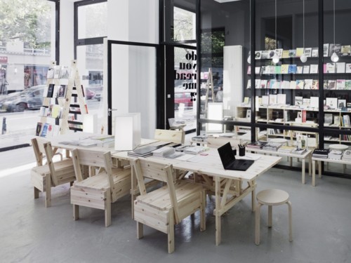
We stumbled onto the Reading Room at do you read me?! by accident, the way you do when you are wandering around an unfamiliar city without any real destination or goal. I discovered later that their Potsdamer Strasse branch (or, as it says on their website, a place for lectures, exhibitions, debates and all the still slumbering ideas and projects) is a sister location to their ‘bespoke’ magazine shop (which will compile a personal assortment based on your interests) and lecture space in Mitte. It is an indication that the area around Potsdamer Strasse is going to be Berlin’s next big art destination, as there are already lots of galleries opening in the area.

Berlin is not short of galleries, nor of bookshops, and so it seems logical that the two should come together in some way. It is therefore also logical that you can ‘curate’ a bookshop, in the same way you might ‘curate’ an exhibition (Berlin is a place where even the trees are curated: see below). Thus the simple but brilliant idea of asking inspiring personalities in art, culture and design to select their current favourite books. It’s not a new idea: literary pages of magazines and broadsheets have been asking authors and cultural figures to chose their books of the year or to name their bedside reading for some time, and here in England, Waterstones, one of the most enlightened of the large chains, has always had a policy of asking their booksellers for personal picks (indeed, most bookshops seem to do that these days).

But what is new (and exciting) here is the presentation. Long thin sheets entitled what do you read?! hang from the walls on pegs (for browsers to take away). One side lists the inspiring personalities who have been asked for their picks, and on the reverse, is an individual selection. For example, the artist Jonathan Monk has been reading The Complete Writings of Donald Judd, American English by Richard Prince, The Jeff Koons Handbook, and lots of magazines, including i-D, Wallpaper, and Hello (yes, Hello). Each title has a short personal description by the selector. So Monk says that Judd’s Complete Writings are ‘A comprehensive guide to very little’ and that Wallpaper magazine is ‘To be read on the toilet. ‘ The inspiring personalities’ comments are generally humorous and meaningful, and give us equal insight into books and readers. A list of what someone is reading is a window into his / her mind and soul.

Each of the inspiring personalities’ books are available for sale, with bright pink cards tucked inside their pages (like library cards) saying which personality has chosen the book and why, so that the selections are cross-referenced.

There are chairs to sit in while perusing. There is coffee.

In another room are general selections of books: art, architecture, design, fashion, typography, cultural essays. Again, baggage restrictions prevented me from going completely crazy, but I came away with a few selections:

I like your work: art and etiquette is Paper Monuments answer to Miss Manners meets Andy Warhol. Various artists were interviewed for their opinions on courtesy in the art world. Jessica Slaven is asked ‘What is the role of etiquette in the art world?’ to which she replies, ‘ The art world should have a separate code of behaviour from civilized society to indicate its self-impressed and savage nature.’ Roger White, in a section entitled ‘How artists must dress’ states that ‘The relationship between an artist’s work and attire should not take the form of a direct visual analogy. A stripe painter may not wear stripes.’ And Wendy Olsoff, when asked ‘When does breach of etiquette play a role in embarrassing or awkward encounters?’ simply answers ‘One kiss, two kisses, or three? One is never sure.’

http://www.papermonument.com/i-like-your-work/

I also bought when you travel in Iceland you see a lot of water by Roman Signer and Tumi Magnússon, described as a ‘travel book’, but which is an illustrated road trip and conversation between the two artists. It is a beautiful book, with an old map of Iceland as the endpapers, and photographs charting the journey.

http://www.hauserwirth.com/publications/69/when-you-travel-in-iceland-you-see-a-lot-of-water/view/

But my best purchase was the Sternberg Press edition of Sung Hwan Kim’s Ki-da Rilke, which is the artist’s illustrated interpretation of Rilke, presented like someone’s secret notebook (interleaved with pink sheets that are not bound, so that they are like interventions or asides), or dog-eared copy with doodles in the margins. Rilke becomes a kind of tour guide or ghostly presence, his poems written out in the artist’s long hand (the way I used to write out poems I liked in a notebook, before the days of computers.

http://www.sternberg-press.com/index.php?pageId=1321&l=en&bookId=216&sort=year DESC,month DESC&PHPSESSID=1d1c226bc171edd2817c997bd7addd90

Eventually, I had to leave the shop. I restricted myself to those three books, as I knew they would be hard to find in London. But I’ll be back.
http://www.doyoureadme.de/

Hello to Berlin

Most cities worth visiting need to be experienced more than once, over time, in different seasons, staying in different quarters. It is essential to have a decent map, to walk as much as possible, to see how different neighbourhoods join up so that you get a feel of the city’s arteries. It’s important to have an itinerary, to know what you want to see, famous landmarks and museums; but it is equally important to wander, to adopt the flâneur’s stance, to rely on local knowledge.

Nowhere more so than in Berlin, a city which seems in constant flux; in places, like an enormous construction site, still only 20 years new since unification. We had visited once before, in the dead of winter, in the midst of a snowstorm, and although our second trip was also in winter, the sun was out, and so were Berliners, sitting in cafés and on park benches. They’re a bit tougher than Londoners, their coats and boots are sturdier (and their dogs have more attitude).

Even with a map, we got lost. Frequently. But getting lost is a good thing in Berlin, because much of what is interesting is hidden; you have to be intrepid and seek things out. This is the city of pop-ups – pop-up galleries, pop-up restaurants – sometimes in temporary structures, or buildings ready for the bulldozer, so you have to be quick. The most vibrant art spaces are tucked away – down alleys, in courtyards, up several flights in office blocks, sharing stair space with lawyers and architects. Many of our finds were accidental, and more treasured for it.

We were in town as guests of Kit Schulte (http://www.kitschulte.com/) whose gallery is located in Schöneberg, in the south west of the city. Galleries have started to spring up here as rents in Mitte become too dear; there is enough of a critical mass to instigate a Schöneberg art walk on the last Saturday of every month. The Schöneberg gallery scene is still not as big as the one around Checkpoint Charlie (now rather loftily referred to as the Berlin Gallery District, complete with its own impossible-to-follow map) or the explosion around Mitte. But Schöneberg is the sort of place where galleries might thrive – a very typical Berlin mix of residential (young families with buggies), Turkish restaurants and gay hotels (the large and uncensored windows of the S & M shops are like Cathy de Monchaux installations). Kit’s gallery is located in her flat – so that the space is inviting, welcoming, part of everyday life (her dog Louie is often to be found in the gallery with his squeaky toy). The rooms are large and light, high-ceilinged, with their original Victorian cornice work.

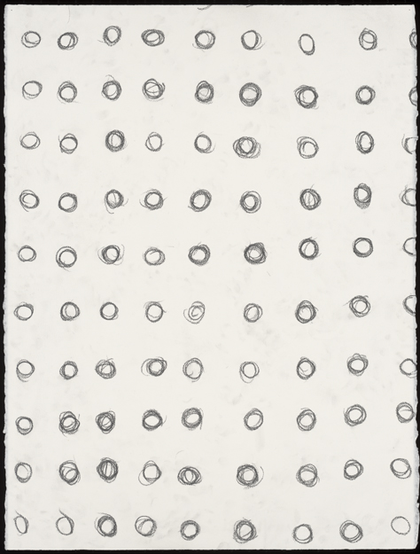
The space is particularly well-suited to the minimal drawings of Linda Karshan and Koho Mori-Newton. Linda’s work occupied the larger room. One wall was given over to works from the recent sequence of woodcuts, the basis for our collaborative edition, Desire Paths. It was the first time I’d seen them displayed on the wall, like grids for an imagined streetscape, and it gave particular resonance to the reading of the poem at the private view.

Koho’s drawings were in a smaller room, giving them a concentrated intensity, like tornadoes. He had hung the side wall of windows with huge columns of grey silk, which looked like tarnished pewter from a distance. The two artists occupied their separate and distinct spaces, but carried on a meaningful dialogue across the parquet floors.

On the Saturday, we ventured into the Berlin Gallery District to visit the Niels Borch Jensen Gallery (http://www.berlin-kopenhagen.de/galerie.html) and Linda’s exhibition with Berlin-based artists Sara Sizer and Dolores Zinny & Juan Maidagan (a husband and wife team of sculptors). Here the show was collaborative and integrated, with the artists responding to each other through the way the exhibition was designed. The afternoon showing was described not as a private view but as an ‘afternoon gathering’ with live music (improvised jazz that filled the space and echoed into the other galleries in the building). Unlike private views in London, this was truly a family event (the kids were having fun in the stairwell, testing out the acoustics in the spectacular Art Deco building, creating their own musical accompaniment).

More space to other places we visited in future posts …

Desire paths

Staphorst is a place you can’t quite place. I was expecting it to be rural, and it is, in a way. We travelled on three trains to get there; from London to Brussels, Brussels to Schiphol. And from Schiphol, heading north, through Rotterdam, towards Meppel; the landscape eventually yielding to wide, flat fields separated by irrigation canals and lined by rigid rows of poplars, with the odd farmhouse or windmill suggesting habitation. But once we had alighted from the train, I was surprised by the amount of traffic. While some of the older women still cycle on ancient pushbikes in traditional dress, there are a lot of cars for such a small town, all heading in convoy to low-built strip malls along the main street. In that respect it reminded me of suburban New Jersey. But the long farmhouses with their painted shutters and thatched roofs brought me quickly back to Holland. None of the houses along the main road are particularly old; although they resemble seventeenth-century dwellings, most were built in the early part of the twentieth century, giving the town a feel of a restored village (again, I thought of America, somewhere like Williamsburg, although Staphorst is not a tourist recreation – this is how people live). The farmsteads grew up in a straight line along the bog; a farmer’s son would build his house behind his parent’s house, and his children behind him, so all the houses are regimented along the main road, facing the same way. There are cows and sheep in the yards, milk pails hanging along the wall, thatched sheds in the back. It is considered to be one of the most religious places in Holland. The town falls silent on Sundays.

It is an odd place then to find an exhibition of contemporary art. But just on the outskirts of town, Hein Elferink has built a gallery next to his house. On the Saturday we were there, light was streaming through the large horizontal glass roof, and we could see the brown forms of winter trees crowding the sky. We were gathered for the private view of works by Linda Karshan and Marian Breedveld; Linda’s drawings, as always, stark in the best possible way, like charts to nowhere, next to Marian’s bright swipes of colour. They worked surprising well together, matched in their sense of pattern and motion (Linda and Marian discovered they had a common background in dance which informed both their works).

It was also the launch of Desire Paths, the edition of Linda’s new woodcuts and my corresponding poem. It is a beautiful production; the sheets emerging from an earth-coloured box, Linda’s woodcuts on delicate tissue-thin Japanese paper, but dark, grained, serious. My poem like an inscription carved in stone or on a tomb. Amazing to think that although Linda was in Connecticut, I was in London and Hein was in Staphorst, the finished result of our project is completely, stunningly integrated. Our paths finally came together, making the title of the work more relevant.

But this is what Hein does. He shows us his presses, his cases of metal type: Fournier (which is the font chosen for our edition), Baskerville, Gill Sans, Bembo. Classic faces. The paper he uses is thick and smooth, a creamy off-white. His boxes are covered in linen, the bindings hand-stitched. This is slow, meticulous work. The book as artifact, as artwork.

So maybe not so odd then, to be in Staphorst. The town is famous for its ‘stipwork’, a traditional kind of button embroidery that decorates caps and skirts. It is a place where people make things with their hands, the way they’ve been making things for years. There is devotion and patience in this kind of making, just as there is devotion and patience in making books, and pictures, and poems …

The language of water

When your writing is going well, does it feel as if words are ‘pouring’ from you? When you’re listening to someone speaking and not really grasping the meaning, do you have the sensation of words ‘washing’ over you? Why a ‘torrent of abuse’ or a ‘sea of troubles’? These watery metaphors represent a pace at which words are measured, the ebb and flow of language; water can describe our way of speaking, of thinking.

There is a Jorie Graham poem called The Surface which is about the experience of trying to describe the fast-flowing movement of a river, but it is also about ‘the river of my attention’, the way the mind moves, ‘bending, / reassembling—over the quick leaving-offs and windy / obstacles’. The poem is broken, fragmented, like the motion of water. It is not possible to grasp it, to hold it, to chart it.

So how do we articulate our understanding of water? As Robert MacFarlane suggested in his opening talk at the recent Place: Taking the Waters weekend at Snape Maltings, perhaps we need to begin by choosing our prepositions carefully. A river is not simply a location nor a feature of a landscape, but a moving, living organism. Speaking of the late Roger Deakin, MacFarlane suggested that rather than being ‘on’ the water or ‘by’ the water, Deakin’s desire was to be ‘in’ it. His book, Waterlog, acted as a set text for the weekend’s conversations – a manifesto for the right to swim. Deakin argues that swimming should be as natural as walking, but we have lost the knack of being fully immersed.

Before he starts the epic swim around Britain that is chronicled in the book, Deakin says, ‘I started to dream ever more exclusively of water. Swimming and dreaming were becoming indistinguish-able. I grew convinced that following water, flowing with it, would be a way of getting under the skin of things, of learning something new… In water, all possibilities seemed infinitely extended.’

As I read these words, a poem kept nagging at the back of my mind. It was only after finishing the book, attending the Place weekend that the lines of the poem became clear, like landmarks on the horizon. The lines describe that experience of immersion, not into a lake or a river, but into the depth of the ocean:

First the air is blue and then
it is bluer and then green and then
black I am blacking out and yet
my mask is powerful
it pumps my blood with power
the sea is another story
the sea is not a question of power
I have to learn alone
to turn my body without force
in the deep element.

And now: it is easy to forget
what I came for
among so many who have always
lived here
swaying their crenellated fans
between the reefs
and besides
you breathe differently down here.

The poem is Diving into the Wreck by Adrianne Rich, a poem which is about the experience of total immersion, into the deep sea, into words, into mythology, an ancient place (which is both the strange subterranean world of mermaids and also the world of words, stories set down centuries before the poet discovered them). It is a poem about immersing yourself in the poem, in words.

Back to Deakin, who could be describing Rich’s poem when he says:

So swimming is a right of passage, a crossing of boundaries: the line of the shore, the bank of the river, the edge of the pool, the surface itself. When you enter the water, something like metamorphosis happens. Leaving behind the land, you go through the looking-glass surface and enter a new world, in which survival, not ambition or desire, is the dominant aim.

Many talks impressed me over the Place weekend, but the artist Simon Read and his maps of the River Deben came closest to bringing water and words together, in Deakin’s spirit of full immersion. Read lives ‘on’ the river Deben, in a Dutch barge he sailed over himself from Holland. But ‘on’ doesn’t feel like the right preposition to describe how his river life has saturated his work. Since the 80s, he has been trying to capture ‘how fluid systems work’ (both rivers and drawing, which he says has its own fluid dynamic), making maps of the river which are beautiful swirling watercolours but also practical, navigable charts, and chronicling in words along the river’s course the alterations to the landscape through coastal erosion, flooding, human intervention. So his maps become palimpsests for the history of the river with many different interventions (the way Alice Oswald’s poem Dart introduced a multitude of voices and experiences of that river).

No surprise to find that his last exhibition was entitled Immersion: Drawing with Purpose.

http://www.simonread.info/

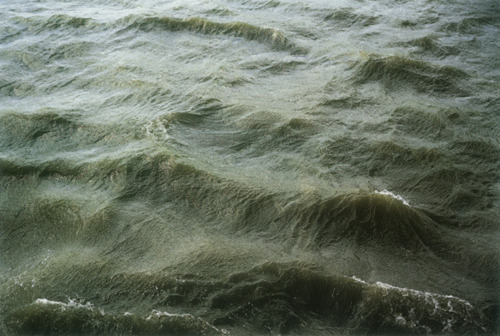
The photo is from Roni Horn’s series of the Thames.

The skull in the study

I’m sitting at my desk in Suffolk, away from the usual sirens and shouts of south London. Since I’m not often sitting at this desk, I’m concentrating on the things that I’ve placed on it to inspire me. Although proper countryside is not far from my window, I still seem to have imported objects from the natural world: a ceramic dish of small chalk-white snail shells gathered on a walk in Spain; a larger wooden bowl filled with a variety of shells of all colours and patterns (from a Victorian collection that was, until I freed them, packed away in a little leather briefcase – some of the shells still have their Latin names inscribed in a neat hand on tiny labels); and a sheep’s skull discovered on the beach at Mersehead in Scotland.

The skull is the size of my hand, so it is almost certainly a lamb’s; the lamb probably became separated from its mother and ended up on the wrong side of the fence. When I found the skull, there was no trace of the rest of the lamb; it was already stripped, bleached, already another sort of form than the frame for the animal’s head it carried. It still has a perfect row of teeth in its upper jaw, two evenly round sockets where its eyes once were.

I think it’s beautiful. That’s why I have placed it here, because it’s beautiful. Why do I think it’s beautiful, this symbol of death? Why do we put things on our desks to remind us of death, when the birds are outside the window and people are getting on with the business of living?

I remember seeing Masaccio’s amazing Holy Trinity fresco for Santa Maria Novella in Florence when I was 19 or 20. What was striking about it was not the depiction of the crucifixion, although the lessons of perspective and the Golden Section were fresh in my head from Dr Forte’s art history class, but the painted cadaver tomb below, made to look as if it was part of the fabric of the church (just another one of Masaccio’s perspective tricks) with the skeleton lying not in the tomb, but on top of it, with an epigram which translates: ‘I was once what you are, and what I am you will become’.

That epigraph has stayed with me, and perhaps has formed me in some way. It’s my belief that most people who create art have an unhealthy preoccupation with death. We have such a short time to make a statement. Ars longa, vita brevis. What you bring into the world, what you make, lives after you, as Billy Collins says at the beginning of his poem, Momento Mori (by way of explaining why he doesn’t have a skull on his desk):

There is no need for me to keep a skull on my desk,
to stand with one foot up on the ruins of Rome,
or wear a locket with the sliver of a saint’s bone.

It is enough to realize that every common object
in this sunny little room will outlive me—
the carpet, radio, bookstand and rocker.

Strangely, there is something comforting in that (maybe it’s the addition of the word ‘sunny’), and something life-affirming about my little lamb’s skull, a symbol of our own mortality, but hard, durable, enduring, and yes, beautiful.

I’ll end on these lines, the first stanza of Carol Ann Duffy’s poem Small Female Skull

With some surprise, I balance my small female skull in my hands.
What is it like? An ocarina? Blow in its eye.
It cannot cry, holds its breath only as long as I exhale,
mildly alarmed now, into the hole where the nose was,
press my ear to its grin. A vanishing sigh.