Twisted limbs

image

Readers of this blog will know that I have written about the artist Berlinde de Bruyckere after discovering her at the Venice Biennale last year. Her vast piece, Cripplewood, had a profound effect – its twisted and injured limbs were crammed into the claustrophobic, church-dark space of the Belgian pavilion. As I wrote at the time, de Bruyckere began the piece after encountering a massive tree that had been uprooted by a storm and had fallen in the middle of a road. From this she imagined a ruined cathedral, its roof vault collapsed in on itself.

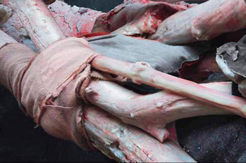
The current show at SMAK in Ghent includes this piece. Inside a light, large gallery, it has a very different impact. Still powerful, but this time the tree is visible to us, and we can see the trauma of its bloodied surface, its construction (wax, formed to resemble wood). It becomes more of a vast supine monster than felled tree, reaching its strange tentacles into the far corners of the gallery. Exposed to us in the harsh white, we see trauma made plain; stretches of grey laced with red.

image

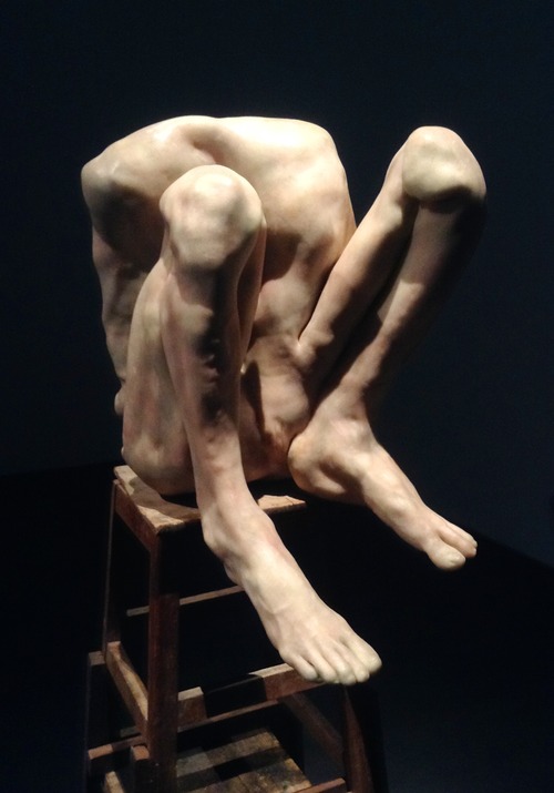
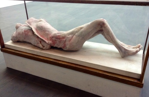
Trauma is the word I carry with me through the rest of the show. Here is the body bent over itself, as if trying to protect its delicate case, or the body jerked into an unnatural pose, pain coursing through every sinew. The pose is often one we recognise: de Bruyckere grew up in the city that gave us Van Eyke’s altarpiece, the centre of Netherlandish religious art, less beautiful and golden-hued than the Italian painters, more earthy and earthly; Christ resembles any ordinary man, he bleeds, we read pain in his face.

image

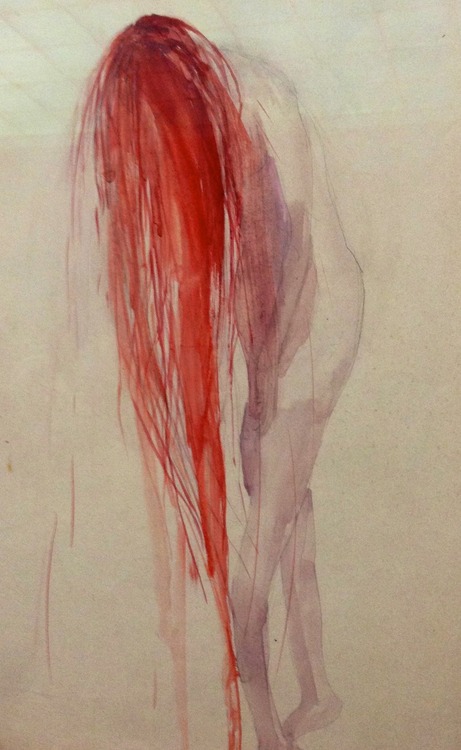
The other great influence is butchery. The artist’s father was a butcher and a recreational hunter, and she retains a childhood memory of animal carcasses strung up, exposing their inner workings. Into her monochrome palette one colour comes streaming: red. It’s the red of fresh blood, bright and horrible.

It is difficult to forget that this is the centenary of WWI, and scattered around the Belgian countryside are the grand cemeteries of that war. In de Bruyckere I’m also reminded of the sketches of the official war artist Henry Tonks, that displayed the most gruesome injuries (Tonks had trained as a doctor before he became an artist) but still managed to capture the humanity of his subjects, in their eyes, their composure. Having said that, the faces of de Bruyckere’s subjects are obscured; it’s the body that speaks.

image

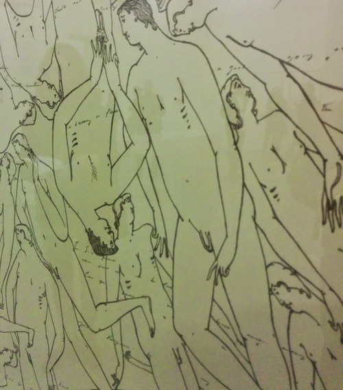
It seems a strange thing to say, but the work is also beautiful. There is a delicacy and grace, especially in the drawings, where the pencil passes over the paper like a whisper. 

This is a stunning and harrowing show. Having recently blogged about the Schiele exhibition, and the Nakeds at the Drawing Room (and having recently run a writing workshop for the Tracey Emin show at White Cube) it feels as if this is the culmination of thinking about the body and how it is exposed. I will be thinking about this work for a long time to come. 
Naked if I want to

image

In a 2008 issue of Cabinet magazine, Alan Jacobs writes of the connection between nudity and shame, beginning with Adam and Eve and their expulsion from Eden: http://www.cabinetmagazine.org/issues/31/jacobs.php. He concludes that even the strategically placed fig leaf is not enough to protect us from ‘exposure’:

Exposure cannot really be undone; what is revealed remains, in memory and image, even after it has been re-hidden. The words of the man and woman are transparently evasive. Likewise, the fig leaves merely call attention to what they are meant to hide, and in fact are another kind of evasion, another way of passing the blame, this time not to a creature or Being but to a part of the body, as though the sexual organs acted of their own accord — even though sexuality clearly plays no part in the story, in either its prohibitions or its rebellions.

image

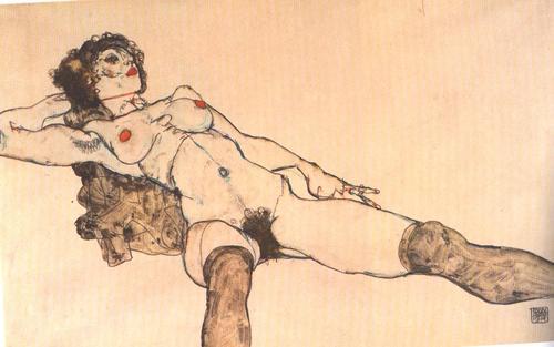
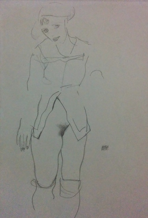
In 1912, the artist Egon Schiele was arrested for sexually abusing a young girl. At the time, Schiele was painting striking portraits of some of Neulengbach’s local children, most of whom were poor and virtually homeless, and Schiele gave them shelter and a sense of purpose; this enraged the local bourgeoisie. When the police arrived at his studio to arrest him, they also seized a number of ‘pornographic’ drawings. Although the charges of sexual abuse were dropped, the judge found the artist guilty of exhibiting erotic drawings, one of which he burned publicly in front of the assembled courtroom. Schiele was imprisoned for a month.

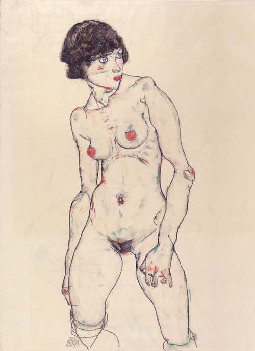
What the good people of Neulengbach really objected to was an artist who flagrantly depicted not simply the body, but its sexual organs, the part that is to blame for our sins. Schiele’s nudes are posed so that we see them from the feet upwards, as if we are crouched over them, their faces furthest from us, sometimes hidden or cropped from the drawing, so we are forced to focus on their centres of desire. They open their legs, finger their vulvas, so that we might see inside the ‘secret cave’, as John Updike said in a piece for the Schiele show at MoMA in 1997; they are not so much exposed as laid bare.

image

Six years after his brief imprisonment, Schiele would die at the age of 28 after contracting Spanish flu. Nearly 100 years on, his drawings are acceptable to polite society; in the pampered halls of the Courtauld, where they are currently on show, they are viewed by well-healed elderly ladies in cashmere twin sets. Of course at the beginning of the 21st century we are nearly blinded by the easy pornography that is just a mouse click away.

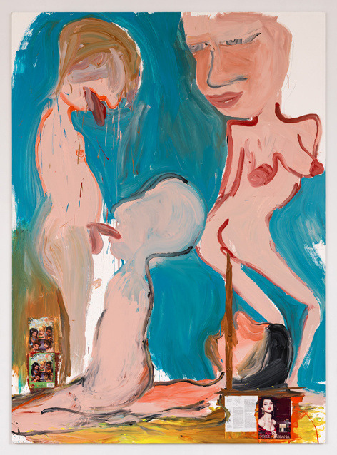
So they have lost the power to feel illicit; have they lost the power to shock? Compared to Paul McCarthy’s new paintings on display just a few miles away at Hauser and Wirth, they are pretty tame. McCarthy uses photographic images from hardcore porn, which are superimposed onto paintings of figures engaging in extreme sexual acts. His palette captures the stained hues of bodily fluids. Hauser and Wirth have blacked out the huge glass windows that face gentile Saville Row, so that entering the gallery is like entering an adult shop in Soho. McCarthy wants us to be shocked, disgusted. The paintings are ugly, his figures are grotesque. This has always been one of his motives as an artist, to present the body as a hideous object, ejecting foul liquids and odors.

image

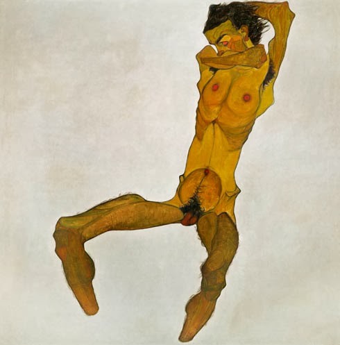
But this is not Schiele’s aim. His palette often suggests bruised flesh or blood, but this is the body electric, to quote Whitman, the soul firing the skin from within. There is love in Schiele’s portraits, sexual love, but also something more – a respect for the living, breathing, procreating figure. There is also pain; the body is twisted, bent into tortured shapes. When we do catch a glimpse of a face, the expression often betrays this pain. Schiele depicts himself so often as a Christ figure, his arms outstretched, his gaunt body splayed open. His work was misunderstood, derided, burnt in public – it is not surprising he made this connection.

image

Somehow, even in pain and discomfort, he manages to convey beauty. It’s difficult to say why; perhaps it’s empathy; we are also naked under our clothes; our carefully constructed outer layers do not betray what’s beneath, the secret cave, the dark core, not only of our bodies, but of our emotional terrain.

On the trail

A lovely Friday evening in late September, and we are on the Art Trail around Bermondsey, hosted by ARTHOUSE1, in conjunction with the London Sculpture Workshop and Drawing Room. All three venues are within shouting distance of each other; a stone’s throw away from White Cube, but it’s a different world entirely once you cross the Tower Bridge Road. Gentrification has been slower to creep across the unofficial boundary between new and old Bermondsey, so there have been opportunities to create new models for galleries and studio spaces. This colonization reminds me of Berlin, a city where both domestic and ex-commercial spaces have been commandeered for art. In this corner of Bermondsey there is a spirit of experimentation, a desire to give both artists and viewers a different, perhaps more intimate and lively, kind of experience.

In a recent article in the Weekend FT, Edwin Heathcoat discusses the phenomenon of the ‘domestic gallery’. As he explains, this is not a recent trend; before the days of the public gallery, museums were established in the homes of collectors. He goes on to say:

Artists have rediscovered the pleasure in displaying their work in the more human context of the domestic interior, on a scale that we can relate to more easily and in an environment less cool and disengaged than the white painted loft or the raw concrete of the pseudo-industrial.

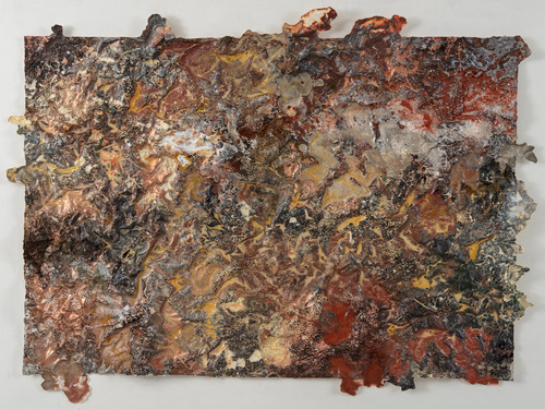
This is certainly the case with ARTHOUSE1, one of the domestic galleries Heathcoat mentions in his piece. ARTHOUSE1 is a late Georgian townhouse, a reminder of what the area would have looked like in the days before the encroaching new builds and warehouses. A sandwich board outside is the only indication that we are in the right spot. Once inside, we climb the stairs to find a modern, clean gallery space occupying the top floor. Rebecca Fairman, the curator, has brought together two artists whose work is complimentary: the ceramicist James Oughtibridge and the painter, Ione Parkin. Parkin’s work particularly impresses me, in its scope and themes (often referencing the natural world, or the landscape of deep space). In the brief talk she gives, she mentions her interest in the alchemic properties of certain materials. In some of the works on paper she has employed powdered copper, to give the surface a jagged and metallic appearance. These works have names like Tundra and Land Mass, suggesting elements of landscape within the abstract.

(Since my visit, a new show has opened with works by Kim Norton and Alexandra Mazur-Knyazeva: www.arthouse1.co.uk)

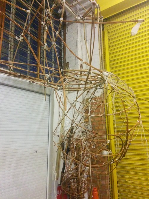
From ARTHOUSE1 we walk down a side street and into the empty tarmac lot surrounding several vast warehouses. There are still light industrial units and storage facilities in the area, hidden-away places that secretly service the city. One of the units houses the London Sculpture Workshop, a not-for-profit space that provides sculptors with 2500 square feet of working area, and facilities, support and equipment that might not be available to them otherwise. The range of equipment is impressive, many items donated to the Workshop or bought cheaply from defunct businesses. Artists can book space when they need it, and can work in just about every medium with a variety of materials, from clay and bronze to sheet metal. We were shown works in progress, and also photographs of an open day, where local residents were invited into the building to create their own art. It is an incredible place, which allows artists, who may not have the support of an art school or the money to source specialist equipment and supplies, the freedom to think beyond such limitations.

www.londonsculptureworkshop.org

From the LSW, we retraced our steps to Drawing Room, the one venue on our walk that I’d visited before, on the occasion of their brilliant show Abstract Drawing, curated by Richard Deacon. The current show The Nakeds is on a similar scale: ambitious, challenging, provoking, with a mix of established artists, such as Tracey Emin, Marlene Dumas, Joseph Beuys and Egon Schiele (anticipating the show of late nudes about to open at the Courtauld), alongside less familiar names, including the extraordinary Maria Lassnig, whose work has spanned the twentieth century, and Stewart Helm, whose voyeuristic drawings of men meeting in parks at night are unflinching and strange; as viewers, we feel we are participating in this illicit act.

Many of the drawings in the show confront our ideas of what it is to be ‘naked’, which conjures ideas of isolation, desire and shame, and is perhaps distinct from the more artistic associations of the ‘nude’. It is a world-class show, curated by David Austin, an artist, and Gemma Blackshaw, an art historian, and their intelligence and consideration of the subject is present in their choice of artists, their juxtapositions, and in their catalogue material.

Drawing Room also has a library, a small shop (selling fabulous books, including their own publications), and a programme of talks, films and courses to accompany each show. Based on the two exhibtions I’ve seen, I would say they are one of the most interesting and innovative art venues in London at the moment. More people need to venture beyond Bermondsey Street and seek them out.

www.drawingroom.org.uk

A Thames walk from Crossness to Erith

Having recently visited the newly-reopened William Morris Gallery, I’ve been thinking a lot about Morris’s ethos for domestic life: have nothing in your houses that you do not know to be useful, or believe to be beautiful. In his time, a feather duster had real feathers and a turned wooden handle. You can still get proper feather dusters in shops like Labour and Wait and Objects of Use, which make fetish items out of common domestic tools. These dusters are expensive; you wouldn’t want to use them to dust. But they make the point that we don’t often step back and look at the ordinary everyday objects around us, and if we do, we probably would agree on the subject of their usefulness, but seldom on their beauty.

The Victorians believed in the ethos of beauty, to the point that they erected beautiful hospitals and prisons, lavishly landscaped cemeteries. Even sewage plants.

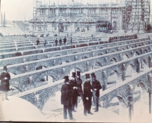
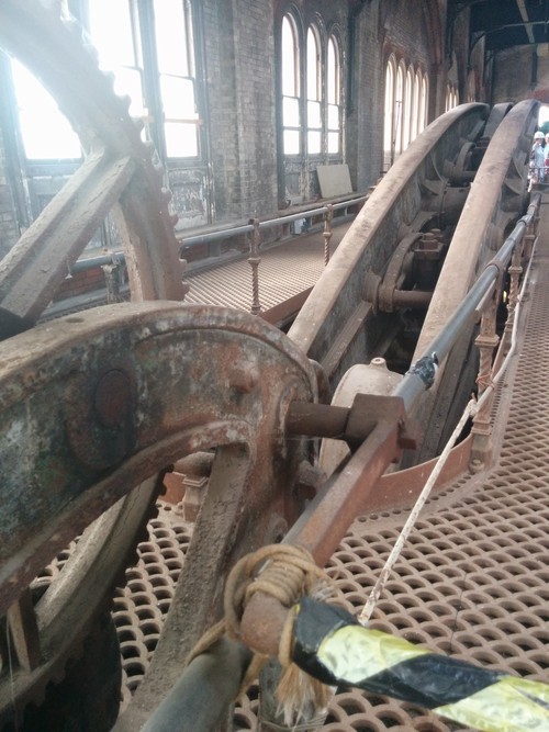
The Crossness Pumping Station was designed by Sir Joseph Bazalgette and opened with great fanfare by the Prince of Wales in 1865. It is a stunning Italianate building – not quite as impressive from the outside as Abbey Mills, which was known as the Cathedral of the Sewers – but inside it has some of the most intricate and stunning Victorian cast ironwork I’ve ever seen. It still holds the four original pumping engines, possibly the largest rotating beam engines in the world, with 52 ton flywheels and 47 ton beams. It is in the process of being lovingly restored.

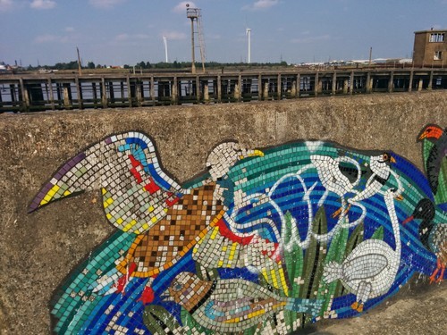
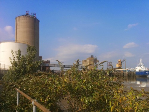
As we walked along the river, we came across more ruins of London’s industrial past. The stretch between Crossness and Erith can only be described as bleak, a truly dystopian landscape. Some factories are still running, their giant plants humming and belching. Disused jetties extended into the river then came to an abrupt end. Cormorants fought over the fish that swim into the warm waters created by the factory overflow.

We reached Erith late afternoon. The sun was still shining brightly on the concrete and rust. Although you wouldn’t know it to look at the place now, Erith had a grand history. It was established in Medieval times, an important religious centre and a port. Henry VIII decided to open a naval dockyard there. 

No one could claim it is beautiful. But there is something impressive about a place that refuses to die, that still gives a home to the most wild and unkempt nature. It is not a destination, but it has its own strange interest. And there is always the river, a sludgy brackish brown in this stretch, but wider here, where it passes under the Dartford Crossing. We felt as if we were leaving London on foot. At Erith, we came off the path and found our way to the station, to head back to the tamer quarters of the city.

That difficult fifth collection . . .

image

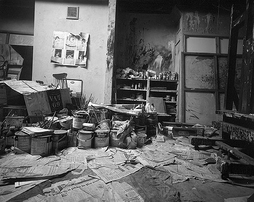
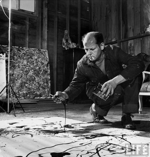
It ought to be easy by now. At least I have come to recognise this stage in the process, which involves spreading all of my poems on the floor, so I have a sort of poem carpet (much neater than Francis Bacon’s studio, which I show by way of illustration). If only I could keep it this way: invite readers to come into my study and walk over the poems, allowing certain words and phrases to lift up, catch the eye, create a collage – the collection as an interactive installation. Having written a whole sequence of poems on Jackson Pollock and his method of placing his canvas on the ground, this ritual makes a lot more sense to me. But I realise I need to wrestle these poems into a book that can be picked up, held, shelved.

image

The poem carpet is a crucial element in my ordering stage. It may be easier for others to see the connections between certain poems, but as the poet, I am hindered by having too much background information; a poem tends to get locked into the conditions of its composition – where I was, what I was doing, what triggered me to write it. The poem carpet is democratic: all poems appear at once and are not subject to my personal filing system. The links between ideas become more apparent (as do the moments when I repeat myself – I have found several instances where I have used the same imagery or syntax to express an idea, and so part of the process is to police my usual verbal ticks). Sharon Olds once made a good suggestion to a workshop group – find the word you’ve used most frequently in your last collection, count the number of times it appears, then ban it from your next collection. I’m not going to reveal what my word was (although I will admit that there were over 30 uses of it in the collection I used to conduct the experiment), for fear that public admission will make it into a quest to find it in all my subsequent poems – as I haven’t managed to ban in completely. As a matter of fact, it could be used to describe one of the central metaphors in this new book, but I am trying (with the aid of my thesaurus) to find new vocabulary.

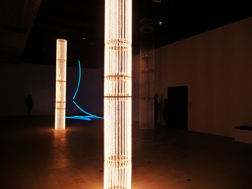
 In getting to this stage, I have already negotiated a number of other important considerations. I have written most of the poems (there are still ‘gaps’, which I will say more about later), although I am still editing / tinkering with some of them. I have the title. The title must be like a giant mouth that speaks all the poems at once and shortens them to one essential phrase. I usually have the titles for my books early on in the process, sometimes before there is even a collection, so I am writing as a way of summing up a certain idea or narrative. In this case, my title poem, ‘The Formula for Night’ came from a Hayward Gallery commission last year, and was inspired by a light installation by Cerith Wyn Evans, but it has framed a larger consideration of darkness / lightness, night / day, death / life, etc.

image

The order is as important as the title. I have put together a provisional, still flexible, order, so certain poems keep moving, and changing as they hook up with new neighbours. I think ordering a collection is an art, almost as difficult and challenging as writing the poems in the first place. The poet wants to create a narrative, or at least a thread, to carry the reader through the book. There is always the knotty question of where to put the title poem – do you want your reader to have the themes spelled out from the very start, or come to a conclusion somewhere in the middle, from which other ideas unravel, or do you want a summary at the end. In this case, the title poem’s location is now fixed – it is the final poem in the book, as the poem’s own finality makes it impossible to follow it with anything else.

So I have this provisional order, and it is great when a trail of poems comes together. But there is always a moment after five or six poems have naturally followed a train of thought when the final poem brings me to an abrupt halt. What follows? Perhaps a silence, but you can’t have that in the book (unless you resort to a Sternean blank page). Chapters, or sections, as in a novel? I have adopted sections in my last two books, but I want this one to be a continuous stretch, like a long night. So I have located ‘gaps’ which I must write into; that means there will still be poems to come to bridge those moments.

The book will be out next year, so there will be the inevitable cooling off period between submitting the manuscript (and then forgetting about it) and seeing the finished book, which always feels alien, as if it has nothing to do with me. And in a way, it doesn’t. It becomes the readers’, to navigate as they see fit. I know lots of people who don’t read collections in the right order; if you end up with a copy of mine sometime at the end of 2015, do remember me on the floor trying to struggle the poems into some kind of shape – and please start at the beginning …